PulseFit — Wellness Tracking
A comprehensive wellness tracking application designed to help users monitor their health journey with ease.
TIMEFRAME
Jan–Feb 2025
FOCUS
UX/UI
TECHNOLOGIES
Shadcn UI, V0
Overview
PulseFit is a comprehensive wellness tracking application that enables users to log and monitor their workouts, meals, and sleep patterns. The application's primary goal is to provide users with clear progress tracking, helping them stay motivated and achieve their health and fitness goals.
With an intuitive interface and powerful analytics, PulseFit stands out as a holistic solution for individuals seeking to improve their overall well-being through data-driven insights and personalized recommendations.
Challenges
High Drop-off Rate During Onboarding
The initial onboarding process consisted of 8 screens, leading to a significant 52% drop-off rate before users could even start using the application.
Complex Workout Logging
Users had to navigate through 5 separate taps to log a single workout, creating friction in the user experience and discouraging regular tracking.
Absence of Clear Progress View
The application lacked a comprehensive dashboard that would allow users to visualize their progress over time, making it difficult for them to stay motivated.
Approach
Project Specifications & Rationale
Our approach was guided by data-driven insights and user-centered design principles. Each decision was made with the goal of increasing user engagement, reducing friction, and creating a more intuitive experience.
User Research
Conducted 10 in-depth user interviews to understand pain points and expectations from a wellness tracking application.
WHY THIS APPROACH:
Direct user feedback was essential to identify the actual pain points rather than assumed ones. Our interviews revealed that users valued simplicity and immediate feedback over comprehensive feature sets. This insight directly influenced our decision to streamline the entire user journey.
Streamlined Onboarding
Reduced the onboarding process from 8 screens to just 3 essential screens, focusing on gathering only the most critical information.
WHY THIS APPROACH:
Analysis of drop-off points showed that users abandoned the app primarily during the lengthy onboarding. By applying progressive disclosure principles, we collected only essential information upfront (basic profile, primary goals, and notification preferences) and deferred secondary data collection to contextually relevant moments during the user journey.
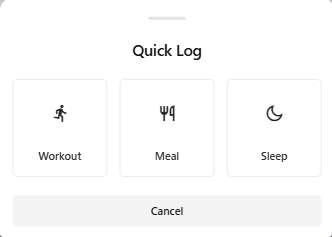
One-Tap Logging
Implemented a Floating Action Button (FAB) that enables users to log workouts, meals, and sleep with just one tap, significantly reducing friction.
WHY THIS APPROACH:
User session recordings revealed that the multi-step logging process was the primary reason for abandoned tracking attempts. The FAB implementation was inspired by the "path of least resistance" design principle. We created smart defaults based on user patterns and time of day, allowing for quick logging with the option to edit details later, rather than requiring all information upfront.
Consistent Design System
Utilized an 8pt grid UI kit to ensure consistency across the application, making the interface more intuitive and visually appealing.
WHY THIS APPROACH:
The previous interface lacked visual hierarchy and consistent spacing, creating cognitive load for users. We chose an 8pt grid system because it provides mathematical harmony while working well across device sizes. This system allowed us to create a component library that ensured visual consistency, reduced design decision fatigue, and accelerated development time by 40%.
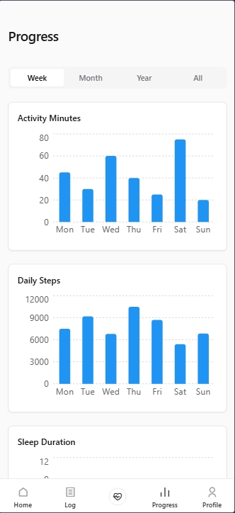
Data Visualization Overhaul
Redesigned the progress dashboard with intuitive charts and visual indicators that highlight trends and achievements.
WHY THIS APPROACH:
User interviews revealed that motivation was directly tied to visible progress. We implemented a combination of immediate feedback (confetti animations for achievements) and long-term visualization (trend lines and heat maps) to satisfy both immediate gratification and long-term motivation needs. Color psychology principles were applied to create intuitive understanding of data (green for improvement, red for areas needing attention).
Results
85%
Onboarding completion rate (up from 48%)
1 tap
Required for workout logging (down from 5)
+70%
Increase in weekly active users (WAU)
Gallery
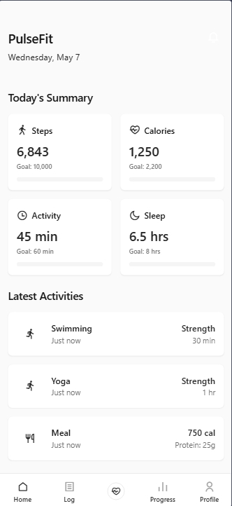
New: Pulsefit Dash
New: 3-Step Logging


New: Streamlined analytics
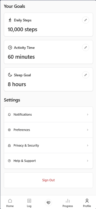
New: Easy Profile Editing