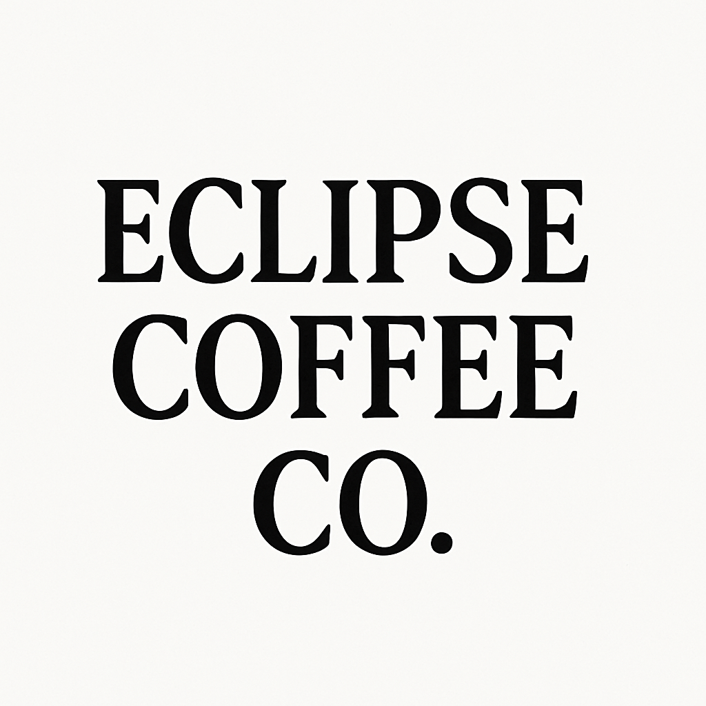
Eclipse Coffee Co.
Minimalist Brand Identity
Background
Eclipse Coffee Co. is a specialty roaster launching its first direct-to-consumer line. They wanted an identity that felt premium yet approachable, with enough flexibility to work across packaging, merch, and digital.
Challenge
Their existing logo was overly complex, didn’t scale well on small labels, and clashed with minimalist competitors. Eclipse needed a mark that carried their artisanal story without visual noise.
Discovery Workshop
- Interviewed founders to understand brand values: “precision, ritual, community.”
- Audited 15 competitor identities to find whitespace in the market.
Concept Exploration
- Sketched 20 logotype and monogram ideas.
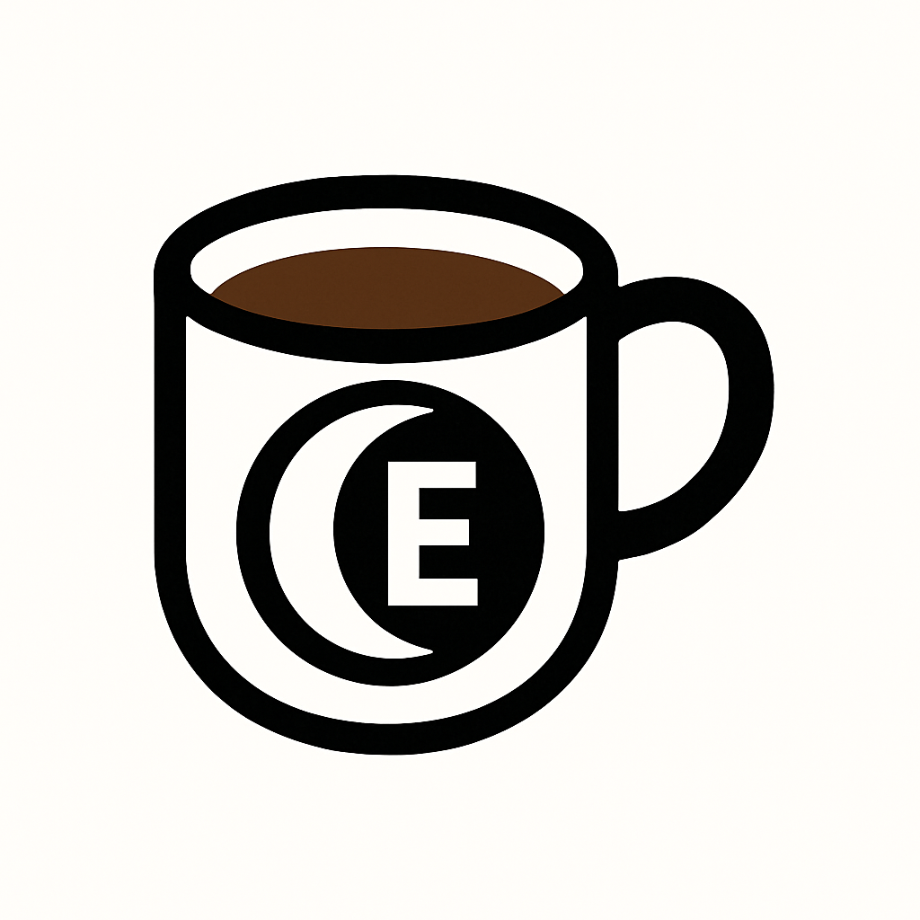
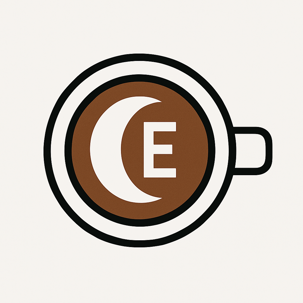
- Reduced to 3 finalists—two wordmarks, one monogram “☾”/“E” hybrid.
Refinement
- Digitally rendered the “E” monogram with a single 1‑px stroke.
- Paired it with Helvetica Neue Light for supporting type.
Style Guide & Mockups
- Defined usage rules, clear space, and color (Black/White + Seasonal Accent).
- Applied mark to bag mockups, rubber-stamped loyalty cards, and tote bags.
Outcome
- The new logo reduced file setup time by 30% (one single SVG, no extra layers).
- Packaging prototypes tested in-market scored 4.7/5 for “clarity of origin.”
- Brand guidelines handed off to printer, digital, and merch vendors in a single PDF.